How To Visualize A Resume In Tableau
Background
I wanted to visualize my resume, simple as that.
There are a many ways to go about building a visualization through multiple open source tools. Since this is a simple and public project I decided not to reinvent the wheel, by coding a new visualization, but rather use a free tool that I am already familiar with and looks good.
Tableau
Tableau is a leading tool in the business intelligence software realm. I am familiar with it from previous work, and have enjoyed how easy it is to use. You can build a professional looking, and completely interactive, dashboard with multiple visualizations and data sources in just minutes.
Tableau Public is a free version where you are forced to publish to a public facing account online to save anything.
Solution
I imagine most information on a resume has a date property and therefore decided that the simplest and most easily read visualization will be a timeline of events over time.
Events can be within categories like work, volunteer, education etc. and can have other detailed properties like location, link, description etc.
To make this process even more simple, I will create the data in Excel.
Data
Tableau has minimal to none data transformation built in, therefore to be able to visualize something over time you need to have a row in your database for every period of time. I thought the month level would be detailed enough to communicate the point and look good, so I created a database of each of my resume events for every month it occurred.
I decided I would identify unique events by a combination of Category, Subcategory, Title and Organization. A sample of what this may look like is provided below.
Data
| Year | Month | Category | Subcategory | Title | Organization |
|---|---|---|---|---|---|
| 2016 | 10 | Education | Masters | MSc. Data Science | ACME University |
| 2016 | 11 | Education | Masters | MSc. Data Science | ACME University |
| 2016 | 12 | Education | Masters | MSc. Data Science | ACME University |
| 2017 | 01 | Professional | Contractor | Data Science Consultant | ACME Corp. |
| 2017 | 02 | Professional | Contractor | Data Science Consultant | ACME Corp. |
| 2017 | 03 | Professional | Contractor | Data Science Consultant | ACME Corp. |
For efficiency, the details of each job are created in a second sheet which will be joined to the first within Tableau.
Details
| Category | Subcategory | Title | Organization | Country | City | State | Link | Details |
|---|---|---|---|---|---|---|---|---|
| Education | Masters | MSc. Data Science | ACME University | U.S.A | Silicon Valley | California | knanne.github.io | Learn to develop widgets |
| Professional | Contractor | Data Science Consultant | ACME Corp. | U.S.A | Silicon Valley | California | knanne.github.io | Develop widgets |
Development
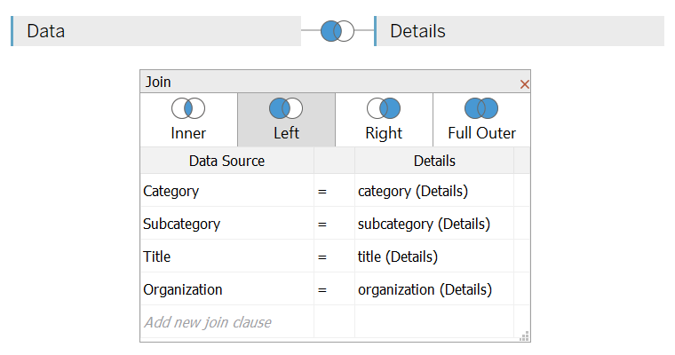
Import the data in Tableau and use a Left Join to match details to events.
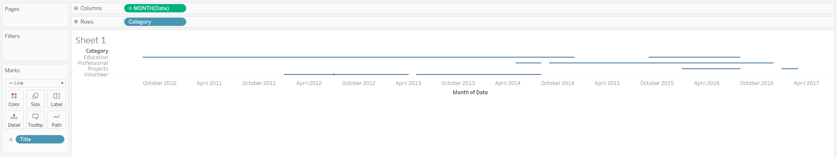
Now we are able to plot Category in the rows shelf by Month in the columns shelf, and add Title to the detail shelf separating each unique job. If you change the Mark type to line you should get something like the following image where we can see each job over time.
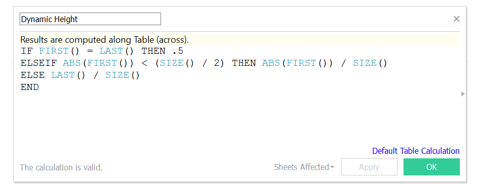
But we want to make it more appealing by adding a 2nd dimension to it. Create a Calculated Field called Dynamic Height and compute an ascending/descending float value by index to form a pyramid shape. I came up with the following:
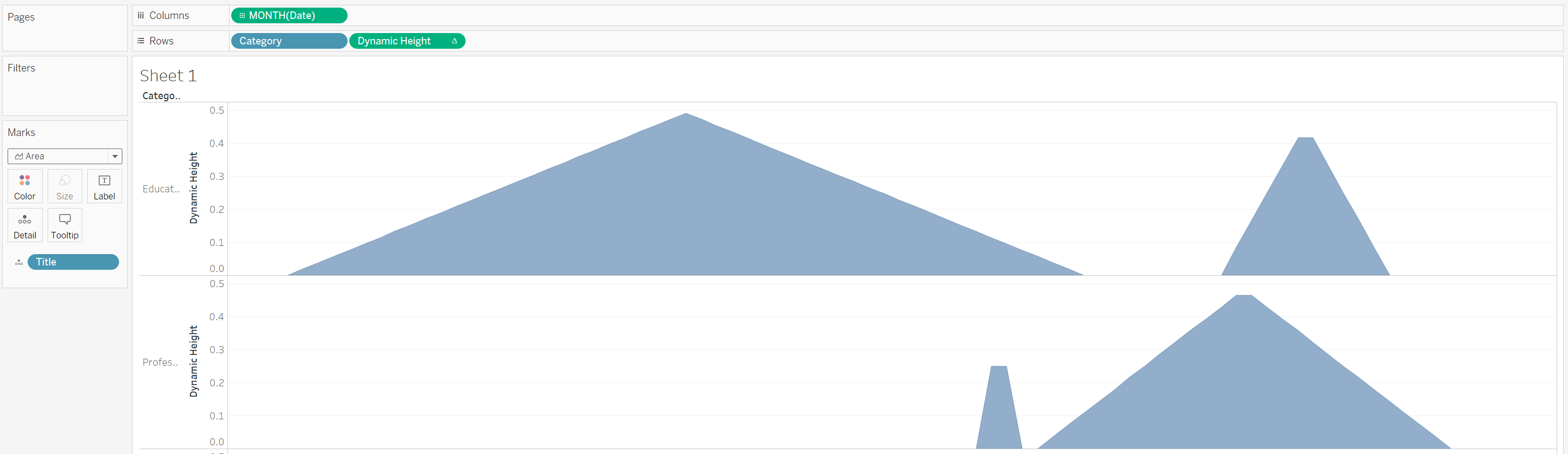
Now add this value to the Row shelf, and change the Mark type to Area.
By default the data in the same pane is stacked on top of each other, we need to Unstack Marks to display multiple events within the same pane side by side. So go to Analysis > Stack Marks and Select Off.
The final template for you to continue personalizing should look like the following:
To continue personalizing, I add the necessary details properties to the Tooltip shelf and customize accordingly. I also colored by Category.
When you are finished, simply go to File > Save To Tablea Public As, sign in, and then get the embed code or share the link as you wish.
Finished Product
Here is the final product I came up with, published on Tableau Public.
